Viva Mexico!

Mexico is not too far from Arizona so it’s easy to get there until…..

You enter the airport and your luggage takes an hour to claim. That’s the first clue that you have arrived to a city that is relaxed.

The most incredible indoor outdoor pool ever!

Mexico does color so I decided to chip into the effort!

Mole! Mole!

The contemporary museum owned by Carlos Slim.

The

Muted colors and what she might be thinking seems so soft.

The colors are so vibrant that it shakes you up and awakes you to the life here!

The Color Orange

Marigolds are probably the most vibrant form of Orange


IMG_0120.jpg

It is believed that the spirits of the dead visit the living during the celebration. Marigolds guide the spirits to their altars using their vibrant colors and pungent scent. Marigolds, or flowers in general, also represent the fragility of life.

IMG_0119.jpg


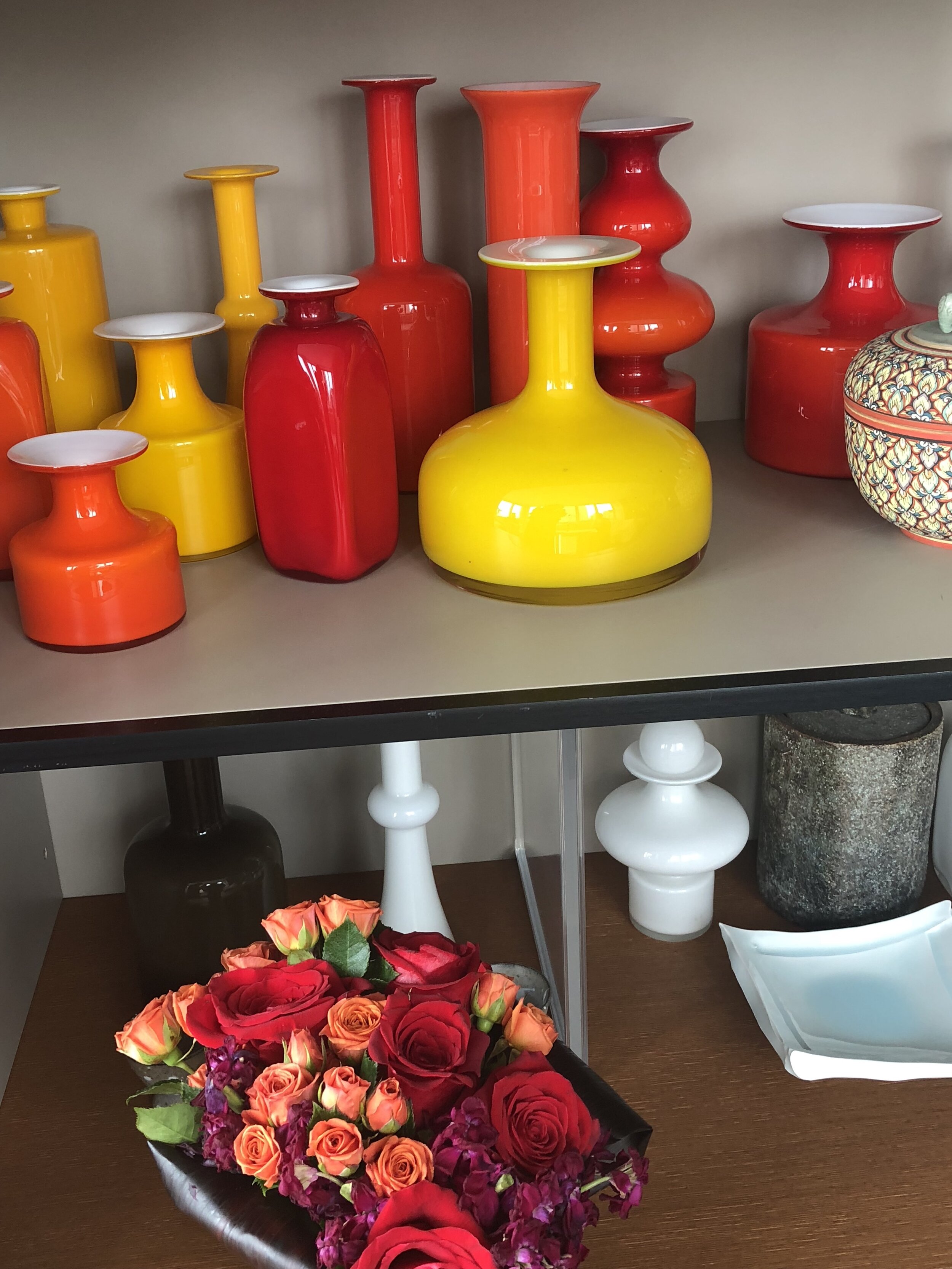
Aside from being offered as a sacrifice to gods from Christian, Aztec, Buddhist, Hindu, and Pagan religions, this little flower has strong ties to the sun and its power to resurrect. All types of Marigold offer the same basic meanings because they all share the same bright yellow, red, or orange color.

Victorian flower language experts considered it a symbol of despair and grief, which is shared with the Mexican cultural conception linking it to the remembrance of the dead during Dia de Muertos.

The Victorians also linked it with cruel treatment towards a loved one. Modern meanings focus on the sunny color and beauty instead, giving the flower a meaning of optimism and success instead.

Marigolds were carried as love charms or spells in the Middle Ages by both genders who wanted to attract someone new.

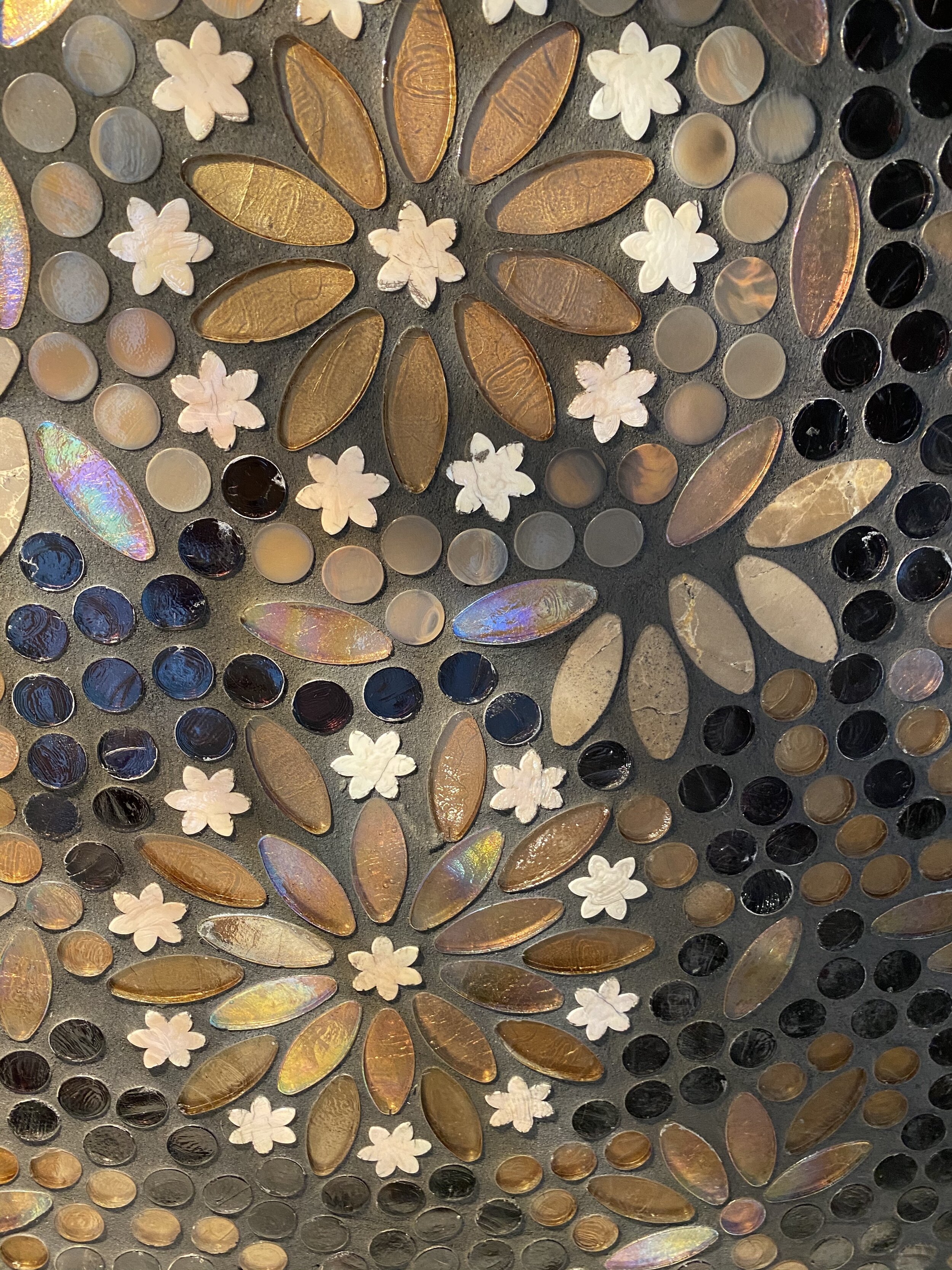
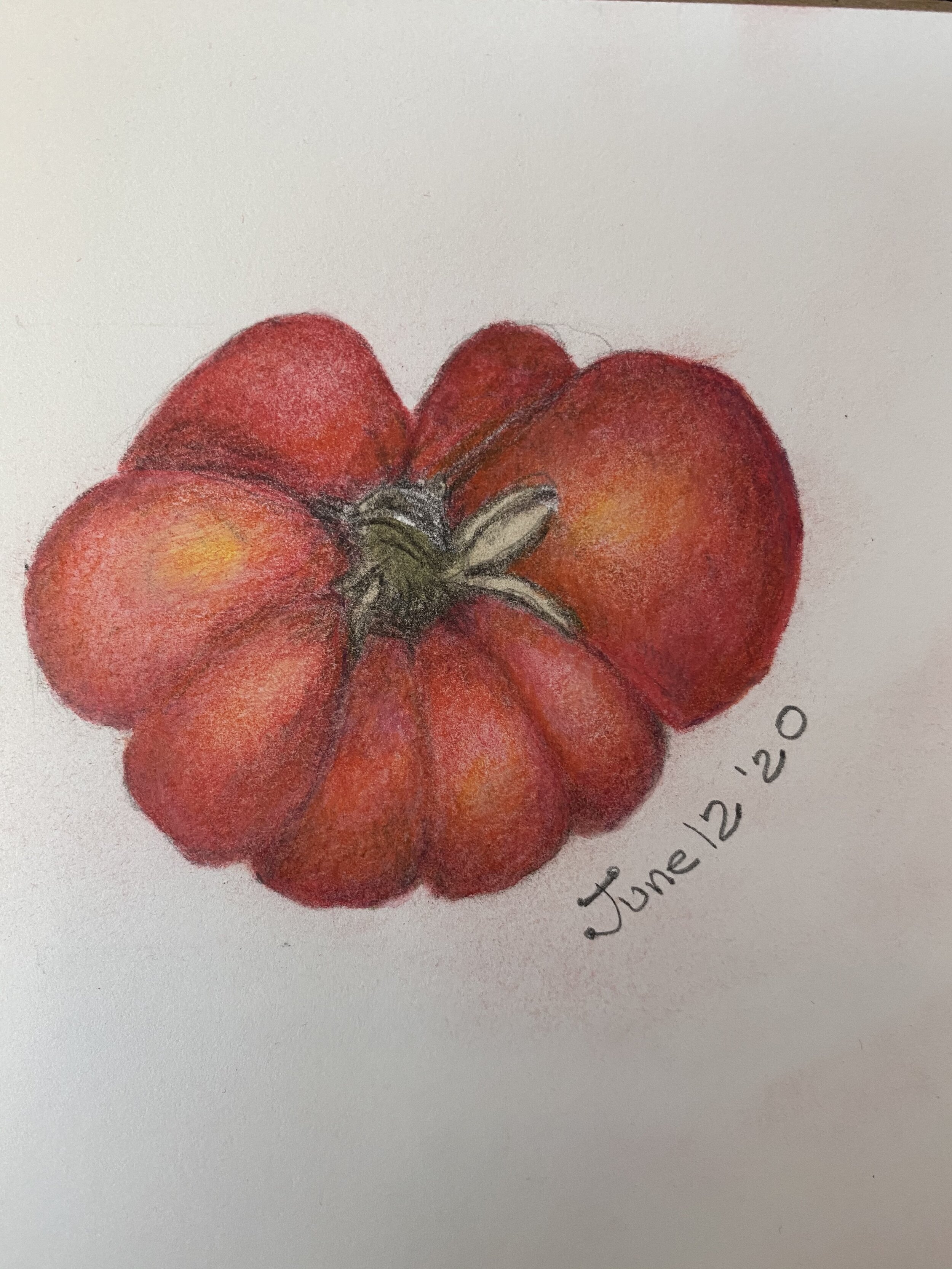
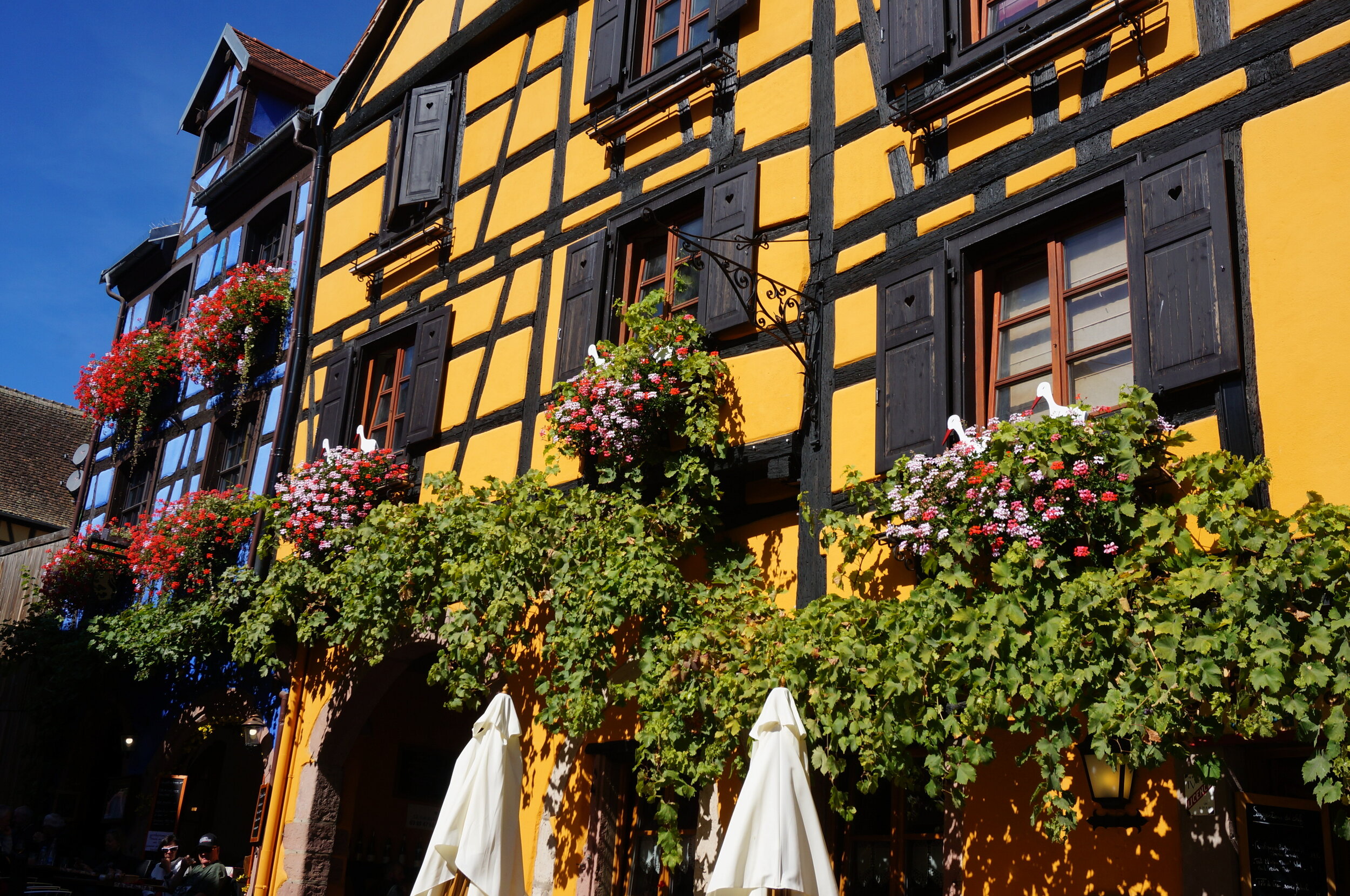
The inspirations for the color orange primarily come from the the parts of the world that use marigolds in their religion services. Then there is the sunlight that gives a golden color, related to Orange, and even wood, adds the golden warmth as a texture. Raw steel, another material that has the strength and the color orange; lava rock; stained glass, a simple balloon.

Although I do not use Orange as a dominate color, I sparingly use the color to add a POP of color by way of fabrics, Citrine glass objects, mosaic, roses, shoes….

Who would have thought that New Zealand has an Art Deco influence?

Truly amazing that while New Zealand is about nature, and the beautiful landscape, by quite a surprise there is a town Napier, that is truly Art Deco style!

Here’s typical scenery in New Zealand. Just incredible!

And then you have this Art Deco town, Napier.

1925

Originating in Europe, in the early 20th century the Art Deco style became widely known following the great Exposition de Arts Moderness Decoratifs et Industriels held in Paris in 1925 and from which its name was ultimately derived.

1931

The 1931 Hawke's Bay earthquake, also known as the Napier earthquake, occurred in New Zealand at 10:47 am on Tuesday 3 February 1931 devastating the Hawke's Bay region. It remains New Zealand's deadliest natural disaster.


Nowhere else can you see such a variety of buildings in the styles of the 1930s - Stripped Classical, Spanish Mission, and above all Art Deco, the style of the 20th Century - in such a concentrated area.

Napier's Art Deco is unique, with Maori motifs and the buildings of Louis Hay, admirer of the great Frank Lloyd Wright.

Enhanced by palms and the angular Norfolk Island pines which are its trademark, and surrounded by fertile fruit and grape growing plains, dramatic hills and the shores of the South Pacific, beautiful Napier is the centre of the Hawke's Bay region…also good white wine! :)

How an art class can change your sense of color....

Have your ever thought to take a class in cooking, so that you can have a better understanding of the taste of foods, or a wine class to learn to develop a better palate for wines?

Why not consider taking an art class if you really want to develop a better sense of color in your home furnishings and accessories?

I’m taking a Botanical Art class on line, inspired by my sister, and taught by an amazing artist Wendy Hollender.

I find that spending time with colored pencils, both traditional and ones that turn into watercolor……opens my awareness to every color I see…whether walking in nature, or viewing a ceramic piece that I have had for years…I just want to say how incredible the experience has been to recognize and know exactly which colors of the spectrum were used in a given object!

I work with color and design and I was shown a sample of a millwork stain last week, and suddenly I knew exactly the essence or the potential formula for the paint and stain…..it was a transformation! Normally I would have gravitated towards the aesthetic and if it was acceptable for a given environment….but this time I really understood the colors behind the product!

I think by mixing colors, especially colored pencils which one can control so much more than paint…you absorb the essence of color.

And the product of that awareness is being able to match colors in your decor and or surroundings, even if you are setting a table, or making bedding choices!

Try it and enjoy!

The most colorful architecture yet!

Just cannot get over the colors that I saw in Alsace…in par with India! Do you think I can stick to the neutral color palette that I love? stay tuned…..

I thought I went to Alsace for wine...but my oh my the flowers!

France is the only nation that holds formal competitions to pick its best-flowered towns. Winners proudly post "Ville Fleurie" signs at entrances, adding one to four painted flowers as awarded by national juries. Four-flower towns are tops, and the Alsace region has 11 of these, making it the nation's best-flowered region.

All of the towns use some of the tax money to plant in public areas. Additionally each homeowner will spend $500-$1,000 dollars on their own home and participate to plant even on the vacant homes!

Between the flowers and the colorful architecture….you can’t help to be incredibly cheerful here…and the Reisling just added to that!

India Trip and Rethinking Colors in Decor

Our trip to India was intense and an eye opener. I have never seen so much color used in all my life!

When I design Interiors I always use a very minimal palette when it comes to color. I like a soft monochromatic background, and when I add color I add it sparingly.

When in India, everyone uses color in their wardrobe to the max!. The smaller and poorer the villages the louder the color becomes. Many villages purposely dress in a particular color, with hot pink being the loudest.

I was so inspired to get on the “Color Train”, and found an incredible spot where fabrics and ornament was sold to all of the hot spots in the USA like ABC Carpet in NYC. When I entered, I knew I could have stayed there for…ever…and I think my husband saw the look on my face and he said…Nancy …like one hour…we are here to see the rest of Jaipur…..so I shopped every wall corner and floor sorting through all kinds of items.


The Golden Temple, Amritsar, Punjab.

The Golden Temple, Amritsar, Punjab.

N9pi%kEtQ5mJuEeDxB3OIg.jpg
Here are some of my most favorite color combinations.

Here are some of my most favorite color combinations.

IMG_5926.JPG
Here are some of my most favorite color combinations.

Here are some of my most favorite color combinations.


From Hindu festivals to Tamil temples, India is home to many religions. What is most refreshing is that everyone meets at the Temples in lieu of Shopping Malls like in America!.

The Golden Temple, Amritsar, Punjab.

YcuIjB7JTjepYBUTKQKd6w.jpg

The Golden Temple appears to float on a “pool of holy nectar” There are over 20 million Sikhs in India, representing a small percentage of the 1.3 billion population!

The community kitchen, where volunteers prepare free food for 100,000 people each day. Vast cauldrons of Dahl and rice.

 
Here are some of my most favorite color combinations.

Here are some of my most favorite color combinations.

IMG_5121.JPG

No I did not go in!

Dahl and Rice oh my!

Dahl and Rice oh my!

Feeling Blessed to have experienced this Holy place. Its a must!The colors of all the people is a delight to the eye. Sometimes I stay with a few colors in design…this is what you get when you use every color possible!

Feeling Blessed to have experienced this Holy place. Its a must!

The colors of all the people is a delight to the eye. Sometimes I stay with a few colors in design…this is what you get when you use every color possible!